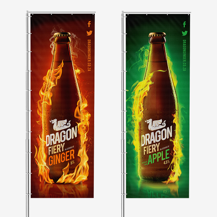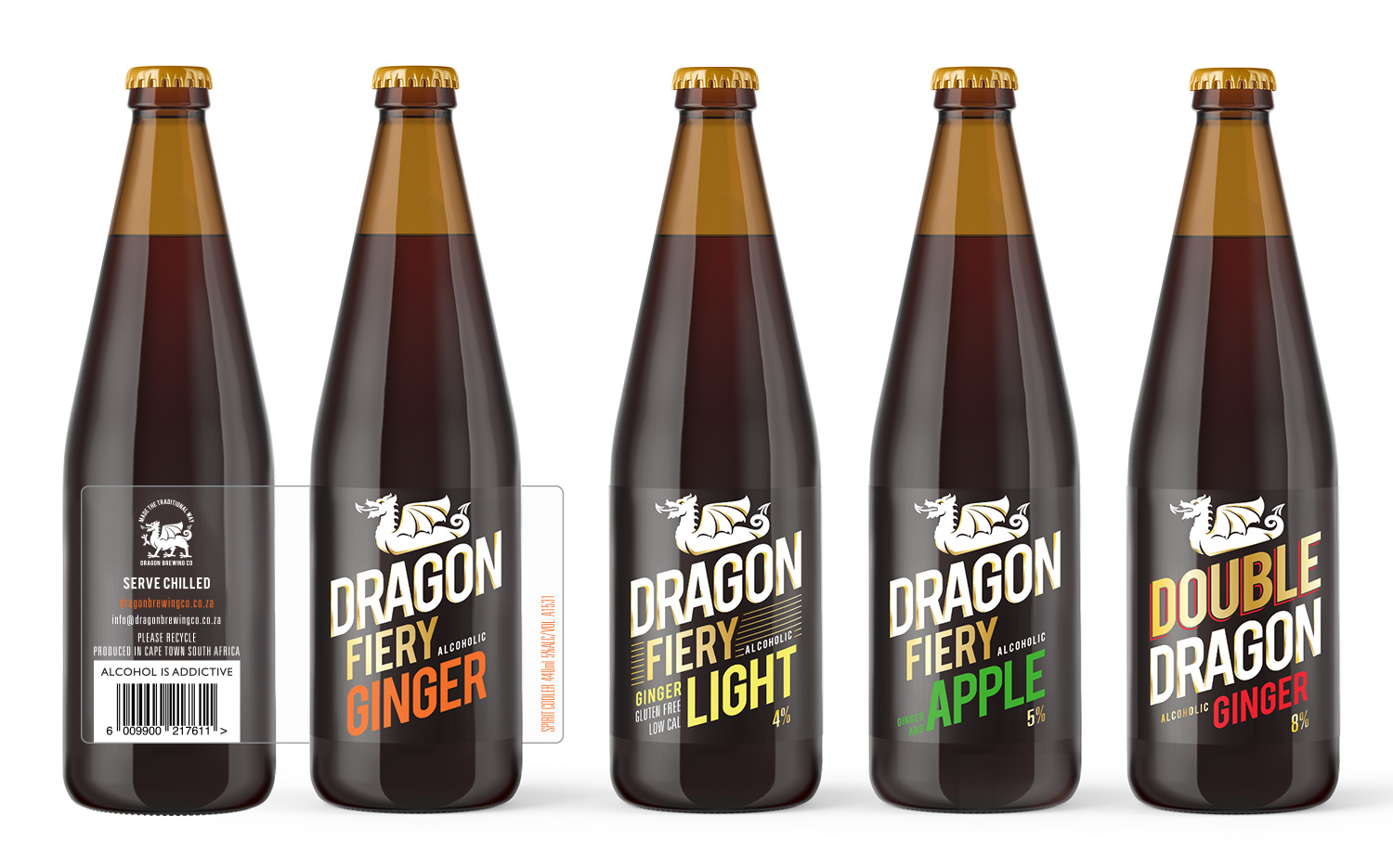
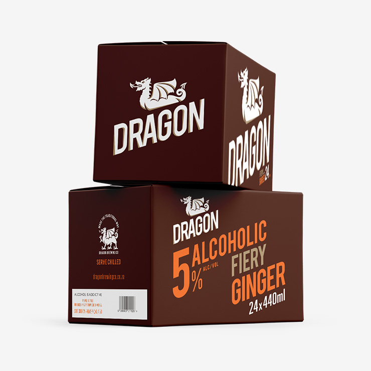
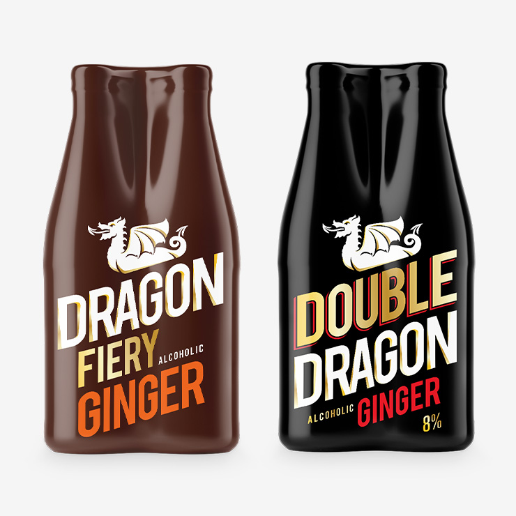
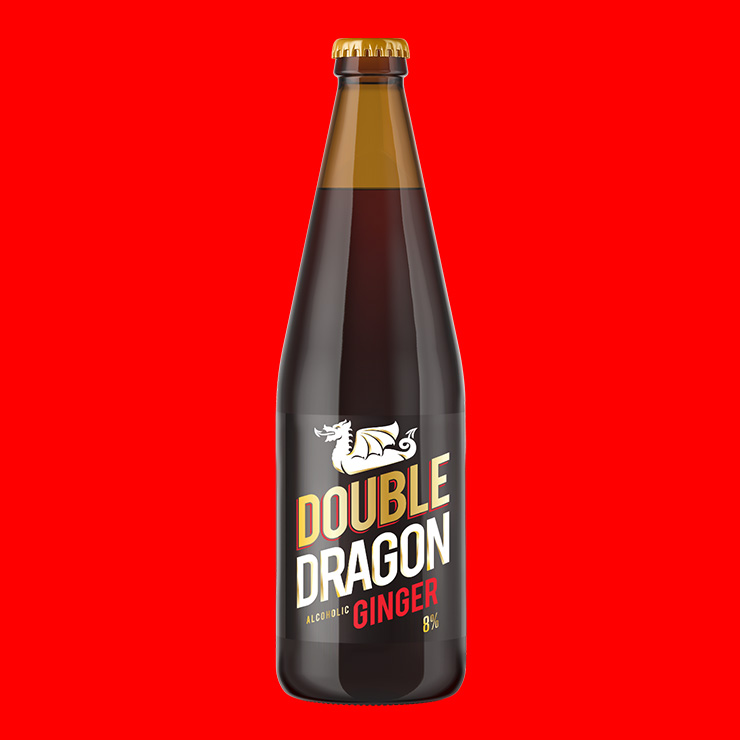
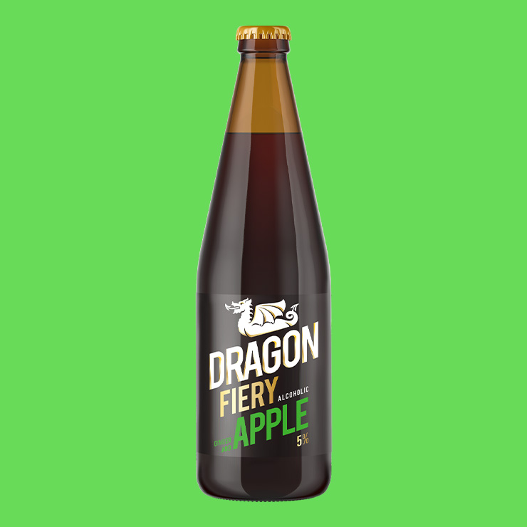
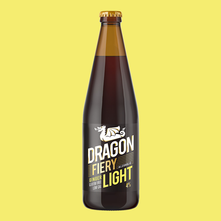
A new identity was created for the Dragon Brewing Company and their iconic ginger beer. Within 6 months of launching the new logo and packaging the brand grew from craft markets to nation wide retailers and exports. The offering soon expanded to include Light, Apple and Double variants that were crafted in line with the flagship Original flavour.
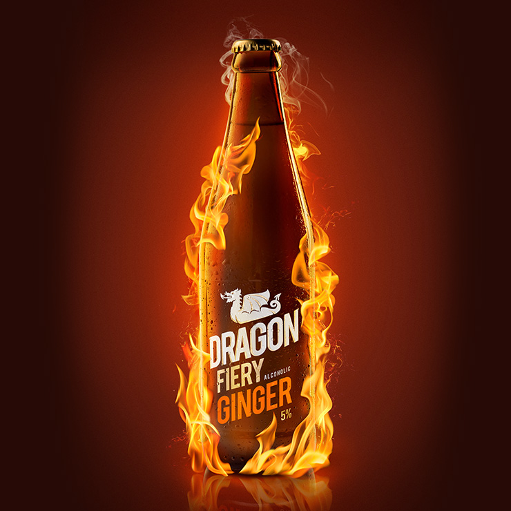
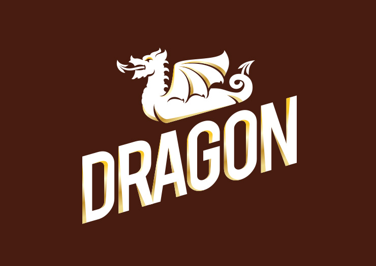
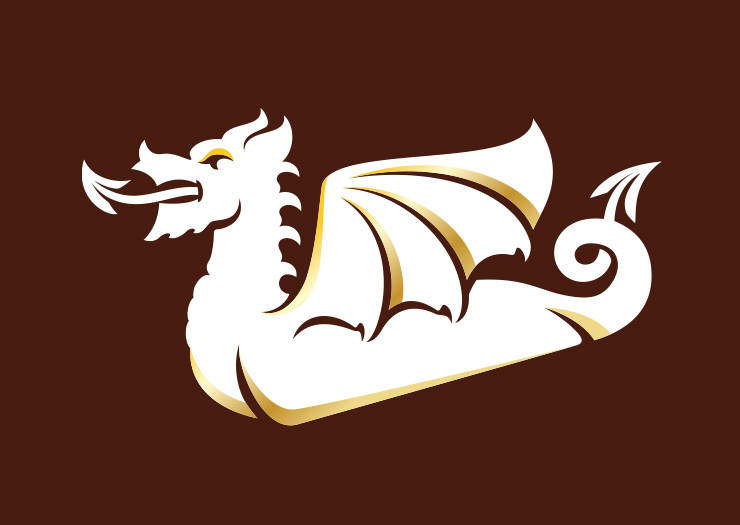
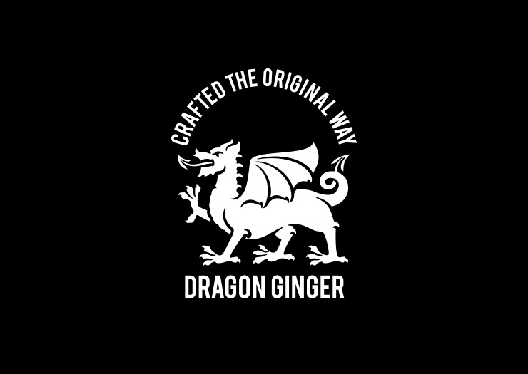
The stylized Dragon logo was inspired by the founder's Welsh heritage. The packaging design sits comfortably in the alcoholic beverage category and distinguishes itself within the fast growing craft beer market with striking typography and colour.
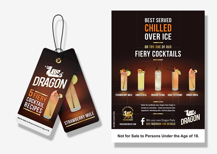
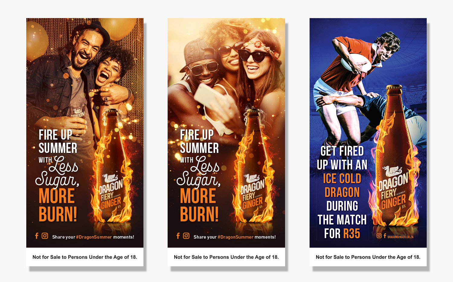
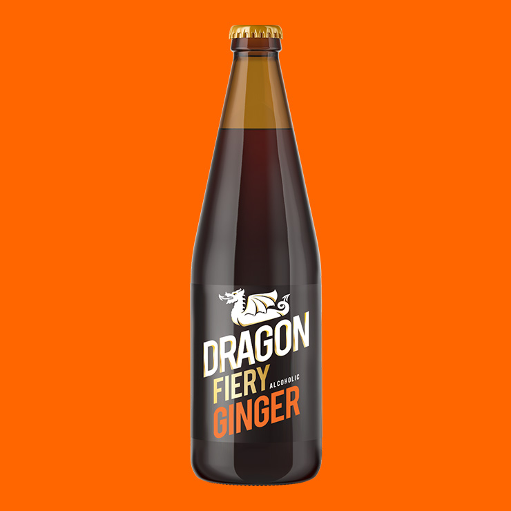
The bottle engulfed in flames became instantly recognizable. The slogan "best served chilled" stood in contrast with the characteristic fiery burn of Dragon Ginger. Point of sale summer campaigns focused on the relatively low sugar content of less than 7g of sugar per 100ml.